

Understanding Scientific Data and Data Types
Imagine you're curious about which type of soil will help a flower grow the tallest. You set up an experiment with three different soil types and plant the same kind of flower in each. Over the next few weeks, you carefully water, observe, and measure. But what exactly are you doing? You’re collecting scientific data—and knowing how to properly identify, collect, and interpret data is essential to every science investigation.
Whether you're running a lab experiment or just trying to interpret a scientific graph, understanding variables, data types, graphs, and common sources of error helps you build real scientific thinking skills. Let’s explore what scientific data is and how to use it.
What Are Variables in a Science Experiment?
To collect meaningful scientific data, you need to identify your variables:
The independent variable is what you change on purpose in an experiment. In our flower experiment, the independent variable is the soil type.
The dependent variable is what responds to that change, what you measure. In this case, it would be the height of the flower.
Think of it this way: the independent variable is what you control, and the dependent variable is what you observe.
Another important part of experimental design is the control group. A control group is a baseline group that doesn’t receive the experimental treatment. It helps you compare results and determine whether the independent variable truly caused a change. For example, you might plant one flower in regular potting soil with no additives. If the flowers in other soils grow taller or shorter, you can compare them to this "normal" group.
Understanding the difference between independent and dependent variables—and why a control group matters—is essential when designing science experiments.
Types of Data Used in Science Experiments
Once you know your variables, it’s time to decide how to collect data. There are two major types of scientific data:
Qualitative data describes qualities or characteristics, like color, shape, or texture. It's observed, not measured.
Quantitative data is measured with numbers, like height, temperature, or mass. It requires clear units.
Even with qualitative data, you can use structured categories (like a color scale) to make your observations more consistent. With quantitative data, it's important to always include units, like centimeters or degrees Celsius, so your measurements are meaningful and replicable.
Visualizing Data: Types of Graphs
The way you present data can make a big difference in how it’s understood. Choosing the right type of graph helps reveal patterns and trends.
1. Scatter Plots
Used to show relationships between two numerical variables.
Each point represents one data pair.
Great for identifying trends, correlations, and outliers.
📌 Example: Plotting soil type (categorical) vs. plant height wouldn’t work well here. But if you measured sunlight hours vs. plant height, this would be perfect.
2. Line Graphs
Best for showing trends over time or across a continuous range.
Data points are connected by lines.
📌 Example: Showing how a plant's height changes week by week.
3. Pie Charts
Represent proportions of a whole.
Useful for showing how data is divided among categories.
📌 Example: Showing what percentage of plants fell into each growth range.
4. Bar Graphs
Use bars to compare different categories or groups.
Ideal for comparing data across distinct categories.
📌 Example: Comparing average plant height for each soil type.
5. Histograms
Similar to bar graphs but used for frequency distributions.
Data is grouped into “bins” or ranges (continuous data).
📌 Example: Showing how many plants fall within specific height ranges (e.g., 0–5 cm, 6–10 cm).
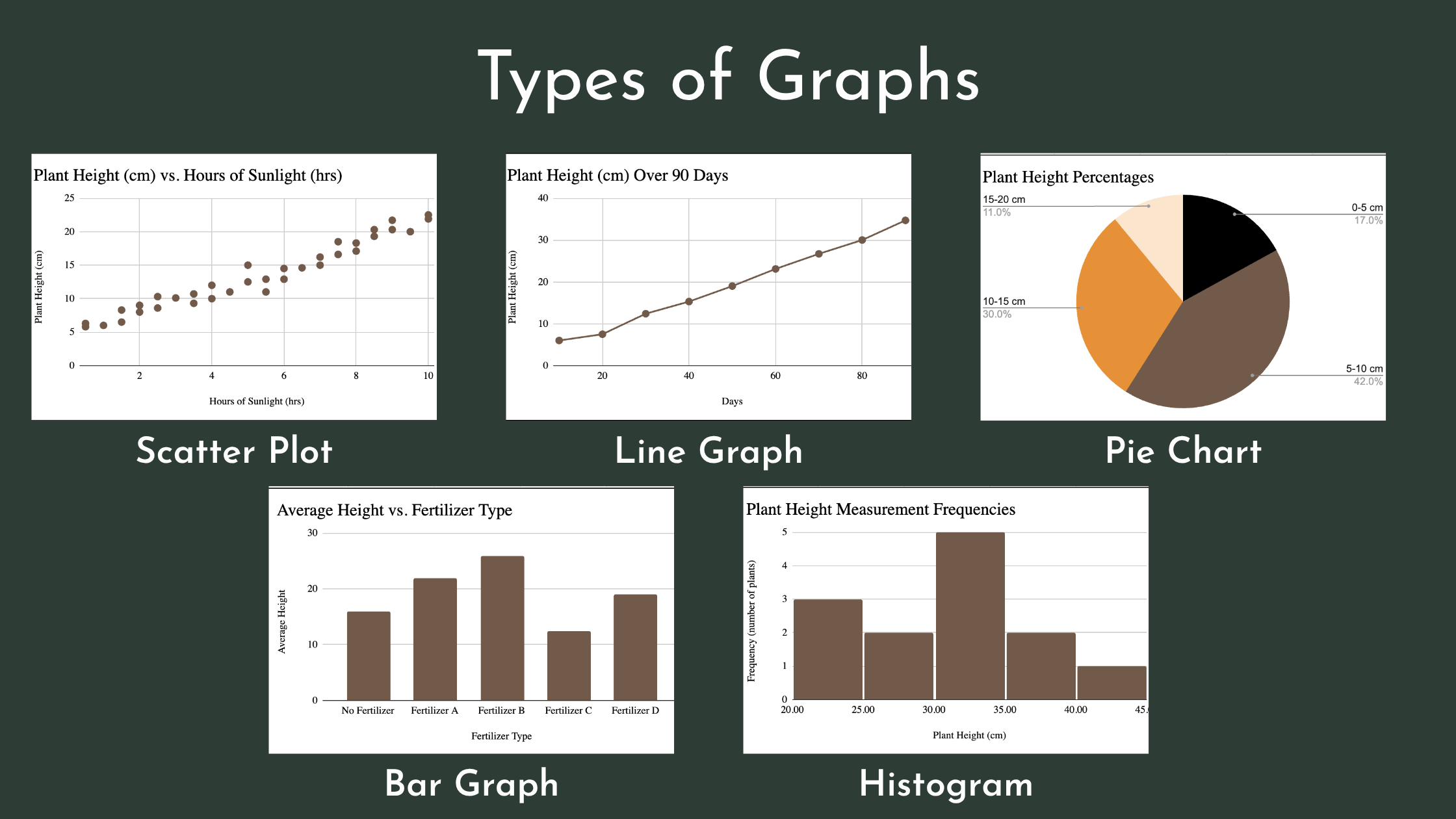
Choosing the Right Graph for Your Data
The type of graph you choose affects how easily others can interpret your results.
A scatter plot helps show relationships between two numerical variables. For example, plotting sunlight hours vs. plant height might reveal a trend.
A line graph is ideal for showing how a variable changes over time. For instance, you could show weekly plant height measurements.
A pie chart is useful for showing proportions of a whole, like what percentage of plants grew in each height category.
A bar graph compares different groups or categories, such as average plant height in three different soil types.
A histogram shows frequency distributions for continuous data, like how many plants fall within certain height ranges.
Bar graphs vs. histograms: Bar graphs compare categories; histograms group continuous data into ranges. In histograms, bars touch because the data ranges are connected.
Learn how to choose the right graph for your science data.
What Makes a Good Graph?
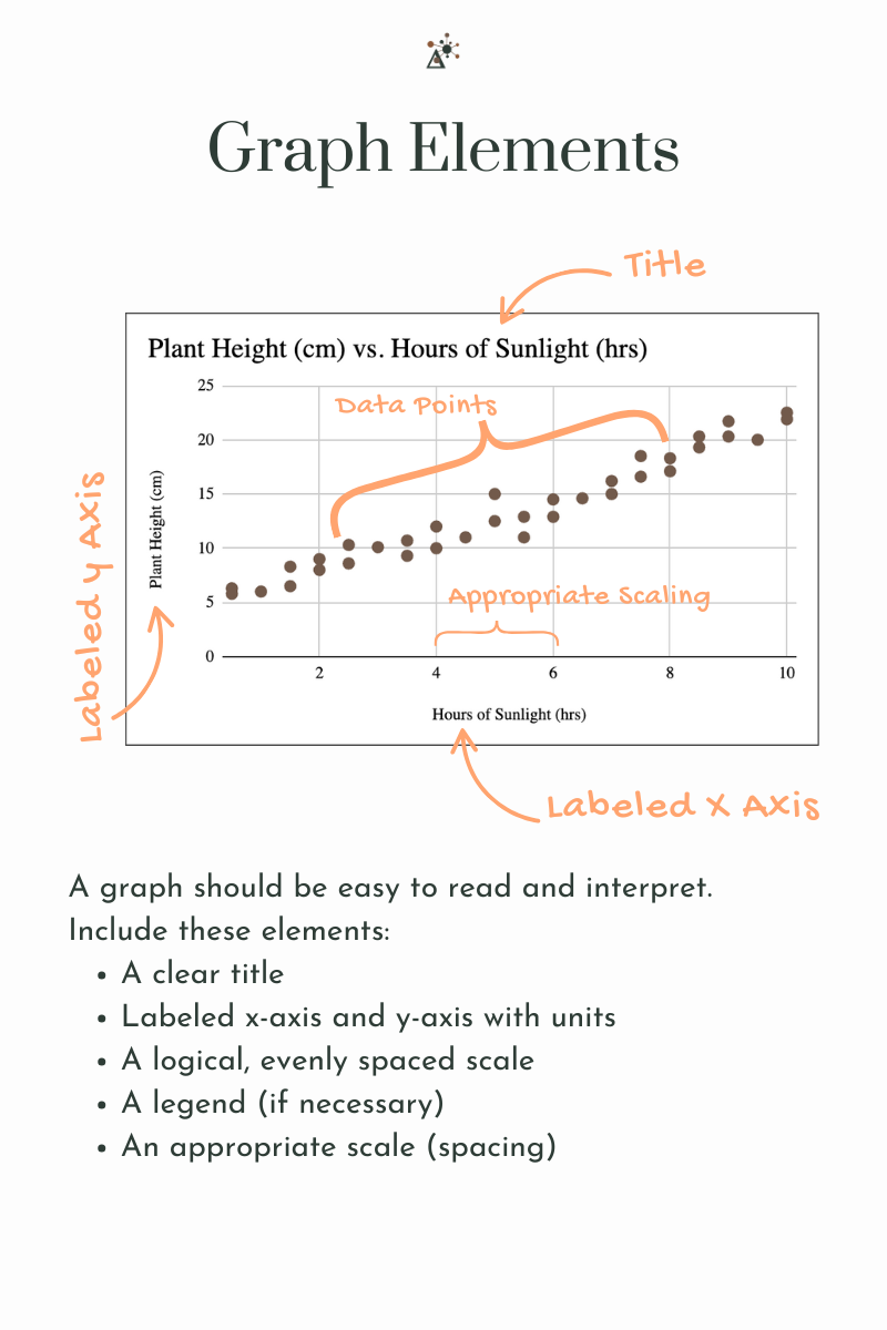
A graph should be easy to read and interpret. Include these elements:
A clear title
Labeled x-axis and y-axis with units
A logical, evenly spaced scale
A legend (if necessary)
An appropriate scale (spacing)
These components help you and others quickly understand what the graph is showing and how the data connects.
Interpreting Scientific Data
Scientific data doesn’t just sit on a chart, you have to make sense of it.
Look for correlations, or relationships between variables:
A positive correlation means both variables increase together.
A negative correlation means one increases as the other decreases.
No correlation means there is no clear pattern.
Also watch for outliers, or data points that are very different from the others. Outliers might indicate an error or something unexpected that deserves more investigation.
Interpreting, or analyzing, scientific data can also be done methodically and this creates the foundation of statistics. Analysis and statistics goes outside of the scope of this post, but there are quantifiable ways to define correlation, outliers, as well as conduct other types of analyses.
Why Accuracy and Precision Matter in Science
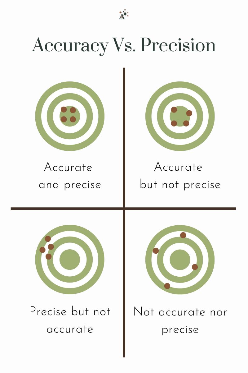
In science, accuracy refers to how close a measurement is to the true or accepted value, while precision refers to how close repeated measurements are to one another.
These concepts are critical in scientific research. For example, if you measure the same plant's height multiple times and your results are very close to each other, your data is precise. But if all your measurements are 3 cm too tall because you didn’t start measuring from the base of the plant, your results are not accurate.
Scientists rely on accuracy to ensure their data reflects reality, and on precision to ensure their results are consistent and reproducible. Experiments that are both accurate and precise can be trusted and used to build further knowledge.
Common Sources of Error and Bias in Experiments
Even in a well-designed experiment, errors and bias can sneak in. Recognizing them is key to improving your investigation and interpreting your results honestly.
Human error can happen during data collection, like reading a ruler incorrectly or measuring at the wrong time of day.
Instrument error occurs when equipment isn't properly calibrated. For instance, a scale that doesn't read zero could skew all your measurements.
Environmental factors can affect your results. Maybe one flower was near a window and got more sunlight than the others.
Bias can be unintentional but powerful. You might expect one soil type to work best, and that expectation could influence how you record observations. This is called confirmation bias.
Sampling bias can occur if your experiment isn’t representative. For example, testing one plant per soil type isn’t enough to make a general claim.
Understanding and addressing these sources of error makes your experiment more trustworthy and helps you draw better conclusions.
Final Thoughts: Interpreting Scientific Data for Students
Designing a good experiment is about more than just asking a question. It requires clear thinking, careful planning, and an understanding of how to collect and interpret the data you gather.
Scientific data helps us explore patterns, test predictions, and make informed conclusions. By understanding the types of data used in science experiments, recognizing sources of bias, and learning how to choose the right graph, you're building real scientific skills.
Whether you're doing a classroom lab or just curious about the world, these tools will help you ask better questions and find better answers.